Geospatial visualizations, on the fly
Map Tool.
This is a simple and speedily built one page map visualization tool. It’s designed for taking some CSV data and ‘joining’ it to a map. The result is thematic mapping which is pretty cool and when done correctly is always a crowd-pleaser on the web.
Truthfully the ’tool’ I wrote is pretty janky. However, it’s MVP and no one using the map part of the project is peaking at the soup of jquery under the hood.
How it’s built
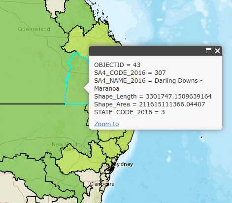
Most of the work is done via the ArcGIS Javascript API. I used the 3.X version of the API <em>esri</em> ArcGIS API for Javascript. This is a Dojo Javascript based API and its pretty amazing for what it does. Without sounding like a fanboy, most of the tools I’ve used from Esri have been great.
I started by chopping into a few of the sample projects as a way to start. While attempting to keep the client-side code simple as I could.
These samples from Esri are fantastic and impressively show what’s possible with a map on the internet. When I was looking at other alternatives like leaflet I didn’t pick them up as easily. This was somewhat due to the fact I’m terrible (not great yet!) at javascript and I was kind of learning that at the same time as I was trying to learn web mapping and the Dojo framework. ArcGIS Javascript was probably no easier than others to learn, And I wouldn’t say I know it well now, but the sample code helped a lot when I was attempting to pick up all that knowledge at once.
The CSV Data Everyone uses Excel. Everyone! What I wanted to do was have a simple box on a page where you could just copy cells from an Excel workbook and immediately start mingling with the data.
Luckily for me when you copy data from Excel it TAB separates the content and just drops it in as raw text when you paste it somewhere. This was easy to parse into arrays which I could then feed into the Class Breaks Renderer to display the visualizations on screen.
Map Joins and Base Map limitations
The really powerful part of this visualization is the Map Join that occurs between a CSV data and the Shapefile.
This is the tool in Action.
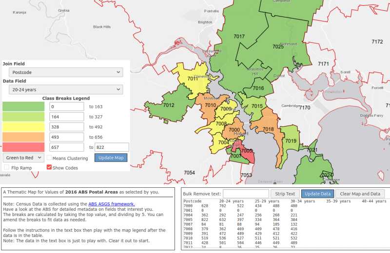

The CSV to Map Join needs a field that is supplied by the Layer from the Map Service. I built the tool to use Australian Post Codes with the ABS Post Code area Map Layer.
Suburbs, Electoral Division and other locales in Australia such as the Australian Statistical Geographic Standard (ASGS) have codes associated but they have a slightly higher barrier to entry to understanding. And my wife who needed this tool for a few quick bits of analysis was working with postcode level data. As such, I didn’t make it any more generic than it needed to be.
It’s important when thinking about what the join field will be. If you’re like me and always use publicly exposed map servers then it’ll be up to you to fit with what’s provided.
If you have your own map server then you have a lot more control over the fields. The only downside is managing all the Shapefiles. It is its own whole big area of work that I don’t really want to dip into anymore.
Level of detail limitations
Below is a map of the east coast of Australia with the red lines representing the boundaries of local suburbs. It’s a pretty clear illustration of why it’s hard to visualize data on a map in Australia.
The key points are:
- Australia is really big. Explore it’s true size
- It’s sparsely populated.
- Where there is population it’s usually dense in a CBD area but then fairly evenly spread out in the surrounding city.
- Where Australians live, they spread out, but in the context of their whole country, they’re really close together.
Points 3 and 4 seem contradictory, but if you want to visualize Australia, the nature of our cities and rural divide make it hard. Whereas visualizing numbers across a city is pretty simple, but you lose the geographic context of the city as part of the wider country because you have to zoom in so far.

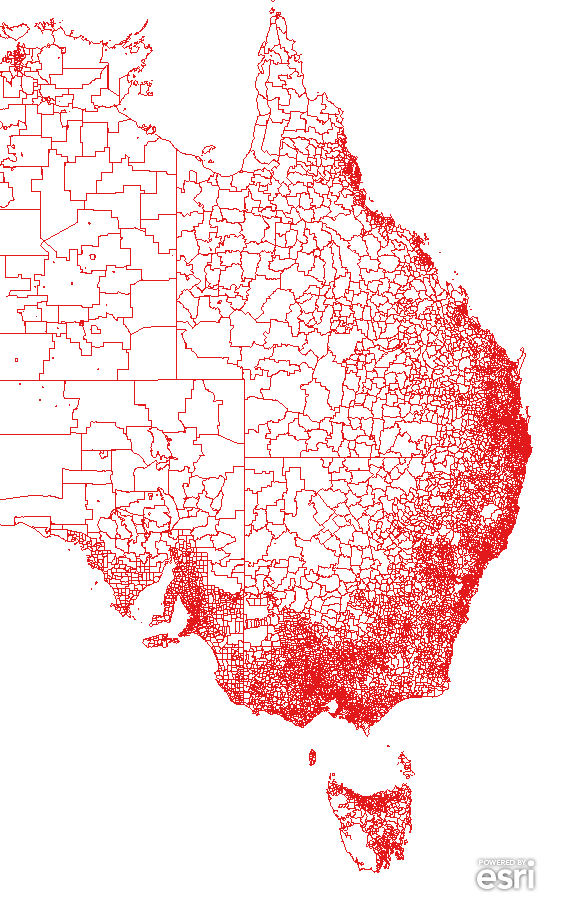
All of those points conspire to make it tricky to do visualizations about Australia. You need to create a map that gives you context, so you can recognize it. But you also want the ability to compare places far away so you can see the difference between two cities like Sydney and Melbourne whilst still understanding their relationship to their local environment.
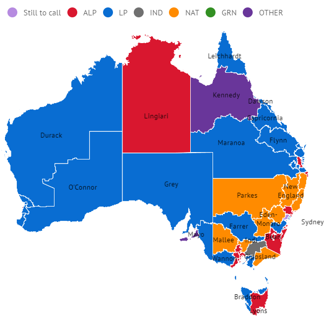
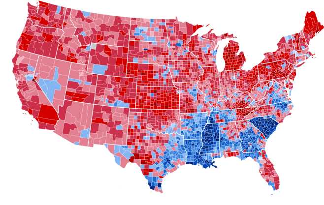
Countries, where the population has spread out into the countryside over centuries, are easier to make impactful visualizations with. A great example is comparing the USA and Australian election maps. In the US you can see the whole country and there are enough people in the regions that a county-level map gives you a good break down that is both reasonably understandable and readable on a screen.
Level of Detail is a tough-ish problem. It’s made especially harder when you want to do anything dynamic as you can’t anticipate what a user is going to do with the tool.
So what does this all mean in Summary? Essentially those awesome sample maps that ArcGIS provides on their website do exactly what they are supposed to. Get you hooked and get you building. But they do gloss over some of the challenges you face with this sort of technology.
-
Crop of Stat Suburbs Maplayer From: https://geo.abs.gov.au
-
Aus Election Map: Reddit.com MapPorn
-
US election Map: Wikipedia