This site: 6 - Sidebar notes. Building a uber simple shortcode.
Digressions
plural noun: digressions
a temporary departure from the main subject in speech or writing.
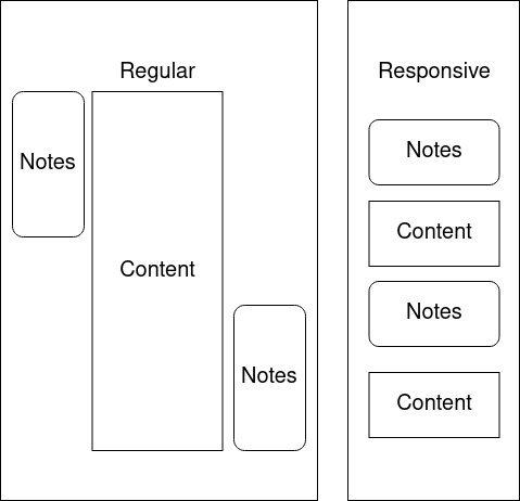
Sometimes my thinking, and writing is like this picture…

When I write here, I usually put my thoughts in Italics. Wait! I know it’s all my thoughts. I’m more talking about the thoughts that happen, that aren’t on the main path. I think them, I usually write them, and then I delete them. I want to stop that. I think I’d prefer to include them.
For a long time I’ve liked the side bar style comments I see in text books or in technical manuals. I’m pretty much going to replicate that.
It’s pretty easy to do in CSS and this image is what I’m aiming for. Regular on the left and responsive on the right.

So my intent is that this text should be above the box of thoughts. Because, this is before my uber simple shortcode.
{{< note txt="rambling less important thoughts etc" pos="left or right">}}
The pos condition is a simple If-Else, the condition makes the default case to place the notes to the right of the main text if omitted.
Three Final things…
Now all I have to do is to use them sparingly. AND, maybe I will now start integrating responsiveness into all my designs… maybe.